UI Designer Embedded widgets
The UI Designer provides a set of default widgets that you can use or customize to design a page or form.
|
Difference exist between a page and a form, but the procedure for designing them is the same. This documentation uses the term page for both pages and forms, unless otherwise stated. |
A page consists of widgets that are arranged in rows, and optionally, containers. The UI Designer provides a set of default widgets that you can use to design a page. The default widgets are available from the palette panel, which is on the left side of the Page editor. A widget has properties that control how it appears and how it is used. There are some general properties that all widgets have, and some properties that are specific to the widget type. You can also create custom widgets. Each widget in the palette has a description. To show a widget description, just roll over the widget in the palette.
Containers
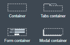
A container is a special kind of widget that contains other widgets. You can create nested containers. A typical use for containers is to control the main layout of your page. For example, if you want to create a two-column layout, you will start your page by adding two containers on the same row, each one spanning six columns of the page. A page does not need to have a container, but it is useful.
By default, a container contains one row, where you can drop component widgets or containers. You can also make the page layout dynamic by repeating a container to display a collection of data.
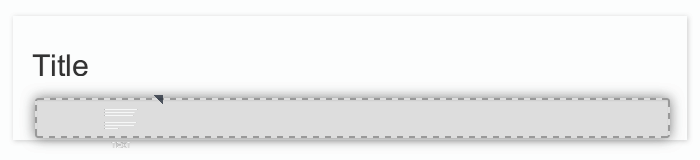
Adding a widget to a row
If the row has some space at the end, the widget will fill the remaining empty space in the row. If the row has no empty space, the dropped component will be automatically resized to fit a row width.
Adding a row
According your needs, a container can have any number of rows.
To add a widget in a new row, a container has two dropzones where you can drop a widget from the palette. These dropzones are located at the top of the container and at the bottom of the container. When your mouse hovers the upper or lower border of a widget in a row, the dropzone becomes visible, as shown in these examples:
Example 1: add a title widget in a new row above a paragraph widget:
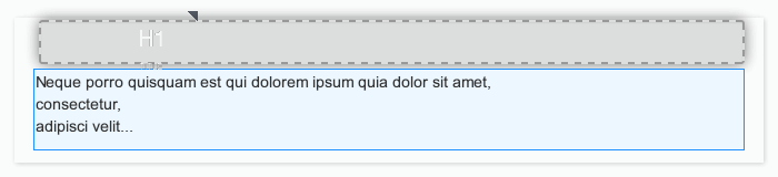
Example 2: add a paragraph widget in a new row below a title widget:
When you drop a widget in one of these two zones, a new row is automatically created.
Repeat content
A container can repeat the content dynamically. This is useful if you need to repeat a set of components for each element in a data collection. Bind the Repeat content property to an array variable. To specify the current element of the collection, use $item.
This is useful if you want to display some property of the current element.
Save as fragment
You can save any container as a fragment (from the properties panel header, widget actions menu). This enables you to reuse the set of widgets in other pages.
Tab container properties
Tabs can be display vertically or horizontally. By default, tabs is stacked above the content. If you want to display tabs in the left of the content, you can follow this tutorial.
Type property allows you to customize the tabs style ('tabs' or 'pills').
Tab properties
Each tab is a container widget. To edit a tab name, select the corresponding tab to display its properties.
The tab’s properties allows you to customize default display and behaviour of tabs based on data and/or JS expressions. For example you can hide or disable tab with a dynamic expression.
Tab title can be calculated dynamically to display and render html.
Form container
Use the form container to enable form validation for input widgets. The form container also exposes a local $form which is the AngularJS form object associated to the form container. In the Bonita Studio, if you define a contract for the task or process and click on the UI Designer icon, the generated form already contains a form container to embed default input widgets to collect the information that need to be passed to the contract to be verified. You can then define the validation you need on the input.
For example, you can bind the button’s disabled property to $form.$invalid to prevent user from clicking the button, until the form inputs are valid.
Modal container
Use the modal container to create a pop-in window.
This modal container can be opened with a button by choosing Open modal in the button’s "Actions" property.
Choose a name for the Modal ID property so you can define what modal container the button will display.
This ID must be unique for a given page.
Any button located inside a modal container can close the modal on success, during any action, when choosing Close modal in the Action property.
The Size of the modal container can be changed by selecting small, medium or large in the drop-down menu.
There is also an option to remove the animation when the modal container appears. Doing so will make the modal container appear instantly, without a fade-in effect. This is useful if multiple successive windows need to be shown.
You can add a little padding between the modal container content and its borders by typing modal-body in the CSS classes property. For a more structured content, you can add different plain containers inside the modal container, and specify any of the following CSS classes for each container, depending on its location in the modal:
-
modal-header, which creates a horizontal line underneath the element
-
modal-body
-
modal-footer, which creates a horizontal line on top of the element
A modal container cannot be located in another container. We recommend dropping all modal containers at the bottom of the whiteboard, for clarity. To embed a pop-in into another pop-in at runtime, drop the first modal container at the bottom, drop the second modal container below the first one, and drop the button that opens the second pop-in within the first modal container.
Input widgets
Use an input widget to enable a user to provide input. In addition to the general widget properties, all input widgets have the following:
-
A Required property which prevents button from being clicked when put inside a form container
-
A Read-only/disabled property which prevents the user from modifying the value
-
A Label (which can be hidden)
-
A property to specify whether input is mandatory
-
A Value property that is used to capture the value entered by the user.
The sections below describe the available input widgets.
Plain input widget

There are four types of input:
-
text: a free-form text field
-
email: an email address
-
number: a decimal or integer number
-
password: like text but each character is replaced by an asterisk.
Currency input widget
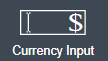
Use the currency input widget to input or display financial data.
The widget is flexible enough to allow any currency, tune the number of decimal digits, choose the symbol position.
Decimal and thousands separators can be also fine-tuned.
Text area and rich text area widgets

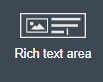
Use the text area input widgets on a form or page to collect large text.
The rich text area allows the user to format and style their input, add images, links, and so on.
You can customize the toolbar for the end-users by selecting options among the available values of the toolbar properties.
Autocomplete widget
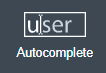
Use an autocomplete widget to offer the user a list of possible values based on data entered in the field. For example, in a firstName field, if the user types chri, the values chris, christine, christian, christiane are proposed. The user selects the correct value. To define the available values, bind a data source to initialize the suggestions. For suggestions that are an array of objects, you can specify a displayed key to identify the attribute to show as a suggestion in the widget. The value must be bound to a variable that will hold the selected suggestion.
See Troubleshooting UI Designer widgets to solve common issues with this widget.
Select widget

Use a select widget to offer the user a drop-down list of values. The user selects the required value.
The available values property is used to populate the list of available values. Alternatively for simple data, you can provide a comma-separated list of values (for example, red, green, blue).
You can also use data binding and specify a variable to populate the list of available values. In this case, specify a label key, which identifies the attribute to be displayed in the widget.
Checkbox widget

Use a checkbox widget to create a unique checkbox. The value property will be true or false, depending on the checked value of the checkbox.
Checklist widget

Use a checklist widget to create a set of checkboxes for the available values, from which the users picks any number of values. To define the available values, you can provide a comma-separated list for simple values (for example: red, green, blue), or bind to a variable that holds an array of values.
If the values are JavaScript objects, you can also specify a displayed key that identifies the attribute to be used to label the checkboxes and a returned key so selected value will return only a specific key rather that the whole corresponding object.
The selected values are captured through the Selected values property.
| Do not bind the Selected values property to a specific item from the available values collection because selected values will be updated each time you modify a checkbox. Do not bind the Selected values to the Available values collection, because this could lead to unexpected behaviors. |
Radio buttons widget

Use a radio button widget to create a set of radio buttons for the available values, from which the user picks one value.
To define the available values, you can provide a comma-separated list for simple values (for example: red, green, blue), or bind to a variable that holds an array of values.
If the values are JavaScript objects, you can also specify a displayed key that identifies the attribute to be used to label the radio buttons and a returned key so selected value will return only a specific key rather that the whole corresponding object.
The selected value should be bound to a variable that will hold the data for the chosen radio button.
Date picker widget
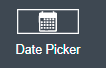
Use a Date picker widget to display a calendar from which the user can select a date or set a date manually (e.g., a date of birth).
To select a date and a time (e.g., to schedule a meeting), use the Date time picker widget instead.
The Date picker widget supports the following types for its Value property as input:
-
ISO 8601 String variables (with or without time information)
-
Date objects
-
Long number values (Milliseconds since epoch)
However, the output of the widget is always a Javascript Date object. So it will change the type of the variable bound to the widget Value to a Date object when the user selects a date. This is required in order to ensure backward compatibility for pages designed with older UI Designer versions.
When sent in the JSON body of a request, the Date object is serialized into an ISO 8601 formatted String variable with the time set to midnight UTC (e.g., 2016-12-31T00:00:00.000Z).
You can configure the displayed date format using a pattern, using yyyy for year, MM for Month, dd for day.
Use the Today button to select automatically and quickly the current day.
For more information about supported formats, read the Angular documentation for date filter.
For a detailed example using the Date picker widget, you can consult the following Howto: Manage dates and times in BDM and User Interfaces.
The calendar can be localized with the usual localization mechanism (localization.json file).
Date time picker widget
Use a Date time picker widget to display a calendar from which the user can select a date and a time or set them manually (e.g., to schedule a meeting).
To select only a date (e.g., a date of birth), use the Date picker widget instead.
Date and time can reflect the user time zone (e.g., a meeting day and time) or be absolute, identical everywhere (e.g., opening hours of a store somewhere). This is controlled by the property Handle time zone.
The input/output of the widget (its Value) is an ISO 8601 formatted String variable (e.g., "2016-12-31T16:30:00.000Z").
You can configure the displayed date format using a pattern, using yyyy for year, MM for Month, dd for day, HH or h for hours, mm for minutes, ss for seconds.
Use the Today and Now buttons to select automatically and quickly the current day and time.
For more information about supported formats, read the Angular documentation for date filter.
For a detailed example using the Date time picker widget, you can consult the following Howto: Manage dates and times in BDM and User Interfaces.
The calendar can be localized with the usual localization mechanism (localization.json file).
File upload widget
Use an upload widget to perform a file upload (POST) on the specified URL. Data returned by the server is stored in the value property.
Button widget

Use a button widget to enable to user to trigger an action. The button can perform a PUT, POST, GET (from 7.1.3), or DELETE (from 7.1.3) request and send data to a given URL.
You can use a variable to hold the resulting data after success or failure.
For pages that are displayed in a task or process context, the button widget can be used to submit a form, completing the human task or starting a process instance. For form submission, you need to define only the data to send. The URL is extracted from the context. When using the Submit task action, you can choose to automatically assign the task to the current user. It will assign and execute the task in a single action.
|
The Tasklist of the Bonita User App does not take that property into account and it is still required to |
Another possible use of the widget button is to add or remove a data from a given collection.
Finally, you can use a button to open a modal container (pop up window) on the page, as long as the modal ID is specified into the appropriate field. Another action for the button widget is to close the modal that contains it.
Every action, except for the Close modal, can close the modal when it succeeds. Setting the Close modal on success property to yes is enough for this to happen.
When inside a form container, the button is automatically disabled while the form is invalid.
Save button widget

Use the Save button widget to store data in the browser LocalStorage. For instance, to let users save the draft of the current form, bind the formInput variable of your form to the value property. A single entry will be created in the LocalStorage identified by the form URL.
Whenever this form is reloaded, either by hitting F5 or browsing away and back again, the entry will be reloaded automatically from LocalStorage.
| The LocalStorage entry will automatically be deleted when the form is finally submitted. |
Display widgets
Use a display widget for information that the user can read on a page. This includes titles, paragraphs, and text. For each, you can specify the text and its alignment. There are several types of display widgets:
-
File viewer, to display a preview of files, either Bonita documents, or external documents. Users can also download the file thanks to this widget.
-
Link, to embed an HTML link for navigation to an external site.
-
Title, for headings. You can set the level from 1 to 6.
-
Text, for chunks of text. Text supports basic HTML tags such a paragraph, list or image…
Table widget
Use a table widget to display data in a table. In order to display the data, first define the headers property with a comma-separated list of column headings.
Then bind the content to an array of JavaScript objects.
Finally, provide a comma-separated list for the columns keys indicating the attribute to display in each column.
| These column keys must not be a number, or start with a number |
To get the data from a selected row, bind selected row to a variable.
With 7.10 update, you can now display html in header or data content when Interpret HTML property is set to true. HTML sanitization is called before rendering to keep only safe HTML.
Customize look and feel
Styling properties are available:
-
Zebra-Striping to set a different background color on even and odd lines
-
Condensed to display cells without spacing
-
Bordered to display cells with border
You can customize default display for zebra-striping or bordered. Here is an example to explain you how to customize default zebra styling.
This styling can be done in the theme.css file in Bonita Studio part to customize all the tables. You need to use the following css selector:
.table-striped > tbody > tr:nth-of-type(odd) {
  // Put you custome styling here
  background-color: chartreuse;
}

.table-striped > tbody > tr:nth-of-type(even) {
  // Put you custome styling here
  background-color: black;
}
In some case, you want override your theme to display custom style for only one specific table, to do this:
-
For table widget, in CSS Classes in property panel, add a class,
zebra-customfor example -
Add the following class in style.css asset
.zebra-custom .table-striped > tbody > tr:nth-of-type(odd) {
  // Put you custome styling here
  background-color: chartreuse;
}

.zebra-custom .table-striped > tbody > tr:nth-of-type(even) {
  // Put you custome styling here
  background-color: black;
}| In embedded Table widget documentation you can found an example for bordered custom style. |
Data table widget

| Read Table widget section to know how you can customize display of your data table widget. |
An extended table widget that provides column sorting, filtering, and paging in addition to the standard table widget facilities.
Set the Data source to Bonita API to populate the data table with records from a Bonita REST API.
Then enter a REST API URL in the URL property. Use the API request parameters property to pass additional parameters to the request.
Supported parameters are described in the REST API Overview and in the REST API documentation for the relevant resource.
You do not need to specify paging parameters (such as ?p=0&c=10), because the data table handles paging automatically when you use a Bonita API data source.
The value of the Page size property controls how many rows are displayed in a table view, and automatically adds buttons to show subsequent pages of the table.
| The column keys must not be a number, or start with a number |
| If your Data source is a Rest Api Extension and you need pagination, you need to provide the Content-Range header in the response, so the Data Table will handle the pagination. In order to do that you can use the method withContentRange in the responseBuilder variable of you Rest Api Extension, something like: |
return buildResponse(responseBuilder.withContentRange(p, c, totalNumberOfElements), HttpServletResponse.SC_OK, new JsonBuilder(result).toString())Alternatively, you can set the Data source to Variable and use a variable definition to point ot the table content.
Note that if you use a Variable datasource and an External API variable, the paging of the table content is not handled automatically.
Sort
The Sortable columns property enables to list the columns which allow a sorted search.
Each element of this property has to match an element of the Columns key property to figure out which table column can be sorted upon.
When a data table is displayed (including in the Preview), the user can click on a column heading to reorder the table rows by this column.
Some fields do not support sorting but still display the sort button which is a known limitation.
The ordering applies to the visible rows in the table, not to the entire table.
The sort is backend when datasource is Bonita API. It is frontend, otherwise.
| BDM APIs are not yet sortable. For other APIs, test in the preview or refer to the BonitaBPM documentation 'REST API' pages. |
Filter
You can provide a filter for users to update the displayed table to show only the rows that match the filter. To do this:
-
Add a widget to the page where the user will specify the filter. This can be an Input widget for free-form text, or a Select widget to choose from a preset list.
-
Create a filter variable in the variable panel. If you are using an Input widget, this variable has no value.
-
Bind the filter variable to the widget.
-
Bind the filter variable to the Data table widget Filter property.
When the table is displayed, each time the user updates the filter, the table display is updated accordingly. The filter is applied to the table rows that are currently displayed.
| it is only possible to filter on attributes that are searchable in the REST resource definition. To search on an attribute of a business object, make sure that the BDM contains the necessary queries. |
Image widget

Use an image widget to display an image. The image widget is able to display images from local assets or an image from a URL:
-
To use an image asset in the image widget, set the Source type property to Asset, and then enter the image name in the Asset name input field.
-
To use an online image in the image widget, set the Source type property to URL, and then enter the image URL in the URL input field.
Note: Applies from 7.0.2
Chart widget

Use the chart widget to create a graphical display of data to ease understanding. This widget is based on angular-chart-0.8.1, which is based on Chart.js.
For information, see the Angular chart documentation or Chart.js documentation.
The widget can display several styles of chart:
-
For a single set of data points:
-
Bar
-
Line
-
Radar
-
-
For one or more sets of data points:
-
Pie
-
Doughnut
-
Polar area
-
Provide each set of data for display in a JSON array, containing numerical values.
You can enter a single array directly in the Value property, or bind it to any variable that provides an array.
For a multiple set chart, bind it to any variable that provides an array of arrays, all sets having have the same length.
The list of values in the Labels property must be have same length as an associated set.
Charts can be customized more deeply using the Advanced options property. To specify advanced options, bind this property to a JSON variable that specifies the options.
Options are specific to each chart type and are listed in the Chart.js documentation in the Chart options section for each chart style (for example, there are spacing options for bar charts).
File viewer widget

Use the file viewer widget to preview or download a file or a process document in any UI Designer artifact (page or form for instance). You can display a document in a modal dialog box or directly in a page.
The previewable documents are limited to documents supported by the end user browser (by default pdf and images on usual browsers). Documents that are not previewable are prompted to be downloaded.
|
If you create a custom FileViewer: edit the
|
See Troubleshooting UI Designer widgets to solve common issues with this widget.
Rich Text Area widget
|
When used out of the box, this widget may expose your application to stored XSS vulnerabilities. To secure itself, Bonita has introduced a toggleable HTML sanitizer filter in its backend. When enabled, this filter will remove dangerous html markup from payload sent to the server. This protection will degrade the user experience of this widget as most of its output will be sanitized. To keep using it safely, you may apply the good practices described on the OWASP Cross Site Scripting Prevention Cheat Sheet. |
Use the rich text area widget to edit HTML formatted text in any UI Designer artifact (page or form for instance).
You can add rich text area inputs for end users to create text to be exported in HTML format for integration on emails, etc.
It can be prefilled with an HTML template.
A options toolbar exposed to end users can be customized and localized with the usual localization mechanism (localization.json file).
|
If you are using this widget in a digitally accessible applications, you could face some limitations (ex: the |
"Widget actions" Menu
From the properties panel header, the "Widget actions" menu provides a list of actions for the selected widget.
-
Use view menu option to view the code of the standard widget in the widget editor. From there, you can clone this widget (to modify or extend it) by clicking on Save as. This will create a custom widget that you can modify as needed.
-
Use edit menu option to edit the widget in the widget editor (custom widget only).
-
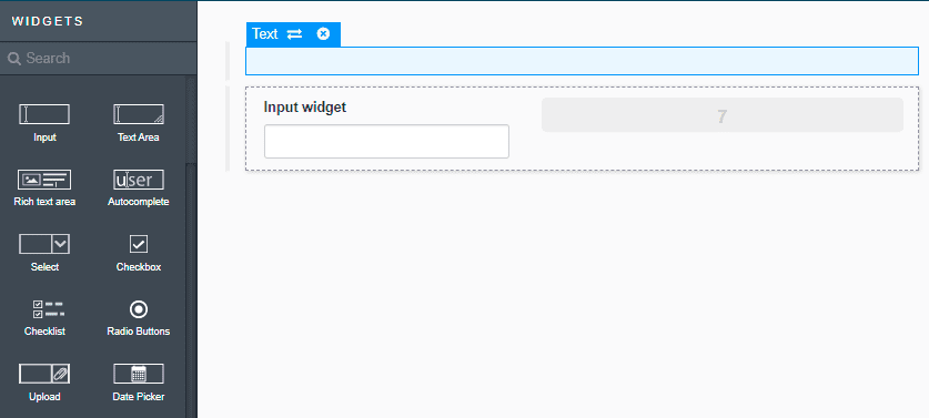
Use the switch menu option to replace a widget by another one and keep the current configuration.
Image below shows wizard of switch widget behaviour
|
This action is not available for containers. |
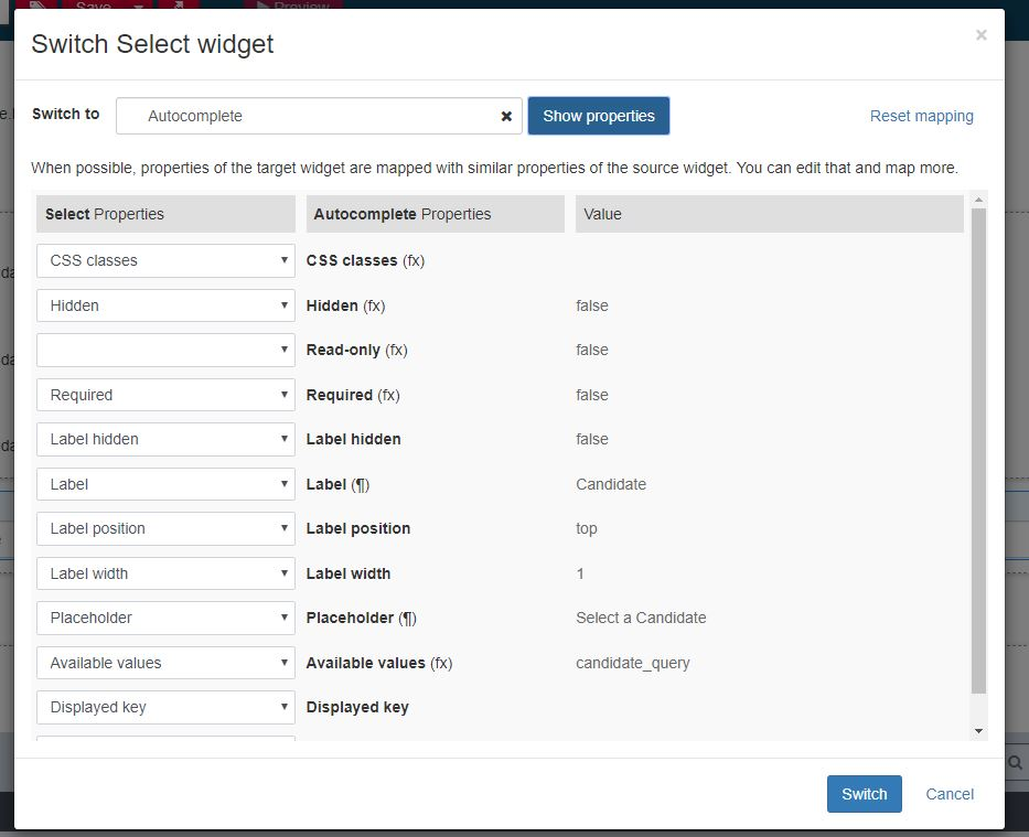
In this wizard, select or type the widget to switch to, then click Show properties.
Whenever possible, properties in the source widgets are mapped with same properties in the target widget.
You can edit that or map more, then click on Switch.
When the switch is completed, you still may have to set properties from the properties panel.
|
Switch feature not available for Internet Explorer 11 and Microsoft Edge. |
Troubleshooting UI Designer widgets
File Viewer widget does not preview a file (although I point on a supported format)
I set the URL property to a pointer on a pdf or image file, but I can’t see the preview: I get a "Preview is not available" message.
Potential cause The URL points on a file without extension (e.g. https://myhost/doc/sample)
Possible solution
Make a custom widget from the File Viewer widget, and adapt the controller.isPDF or controller.isImage.
Autocomplete widget does not update its displayed value
Autocomplete widget does not update its displayed value when the value is changed by a variable.
Possible solution
Make a custom widget from the Autocomplete widget, and update the controller by replacing the function that set the formatLabel as follows:
  this.formatLabel = function ($model) {
    if (this.selectedItem) {
      let sel = this.selectedItem;
      this.selectedItem = undefined;
      return this.getLabel(sel);
    } else {
      if (typeof $model === 'object') {
        return this.getLabel($model);
      } else {
        return $model;
      }
    }
  };
My custom styling on pbChecklist or pbRadiobuttons isn’t working as it was in previous Bonita UI Designer versions.
My custom css rule, from a theme or a css file is not applied after the migration on 2026.1.
Potential cause The internal HTML templating has been changed so that accessibility rules could be applied for the two widgets.
Possible solution Check you custom css selector. For example, <label> html tag has been replaced by <legend>. More details are available in UI-Designer, Editor > Help (in the top right corner) > Migrations.