How to display a vertical tabs container on all devices
Goal: Display stacked tabs on mobile and juxtaposed tabs on desktop
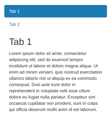
Since Bonita 7.10 tab container evolutions, it can be tab display can be displayed Vertically thanks to bootstrap configuration parameters. This will cover specially use cases where tabs needs to be display in mobiles as tabs and contents will be stacked. To do that it is enough to configure vertical property at tab container properties panel. We recommend to switch type from tabs to pills, rendering is nicer in pills than default style as tabs.
In counterpart, in the version v0.30.1 of bootstrap there is no provided style to display the content at the right side of vertical tabs, which is a usually desired when using larger devices.
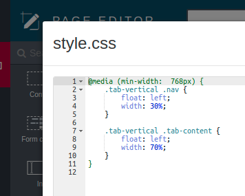
To have a tab container displayed on all devices (mobile / desktop) modifying display based on devices size you could use css as described below, but feel free to extend it to match your specific needs.


