Process Compare
This document serves as a comprehensive guide for understanding and utilizing the BPM Dashboard for effective process management. It provides detailed insights into the various charts and metrics presented on the dashboard, facilitating a deep understanding of the process execution within the BPM context.
The Process Compare Dashboard is a powerful tool for comparing two versions of a process or the same process with different parameters. Whether you’re a process owner, analyst, or executive, this dashboard equips you with the insights you need to optimize processes and achieve operational excellence.
Introduction
This document provides comprehensive documentation for the Process Compare Dashboard. The dashboard is designed to compare the performance and execution details of different process instances within a Business Process Management (BPM) context. Specifically, it compares two instances of the selected process from your application or it can also compare the same process on 2 time frames. This documentation covers the charts and visual representations as well as the various metrics and key performance indicators (KPIs) visible on the dashboard.
Dashboard Overview
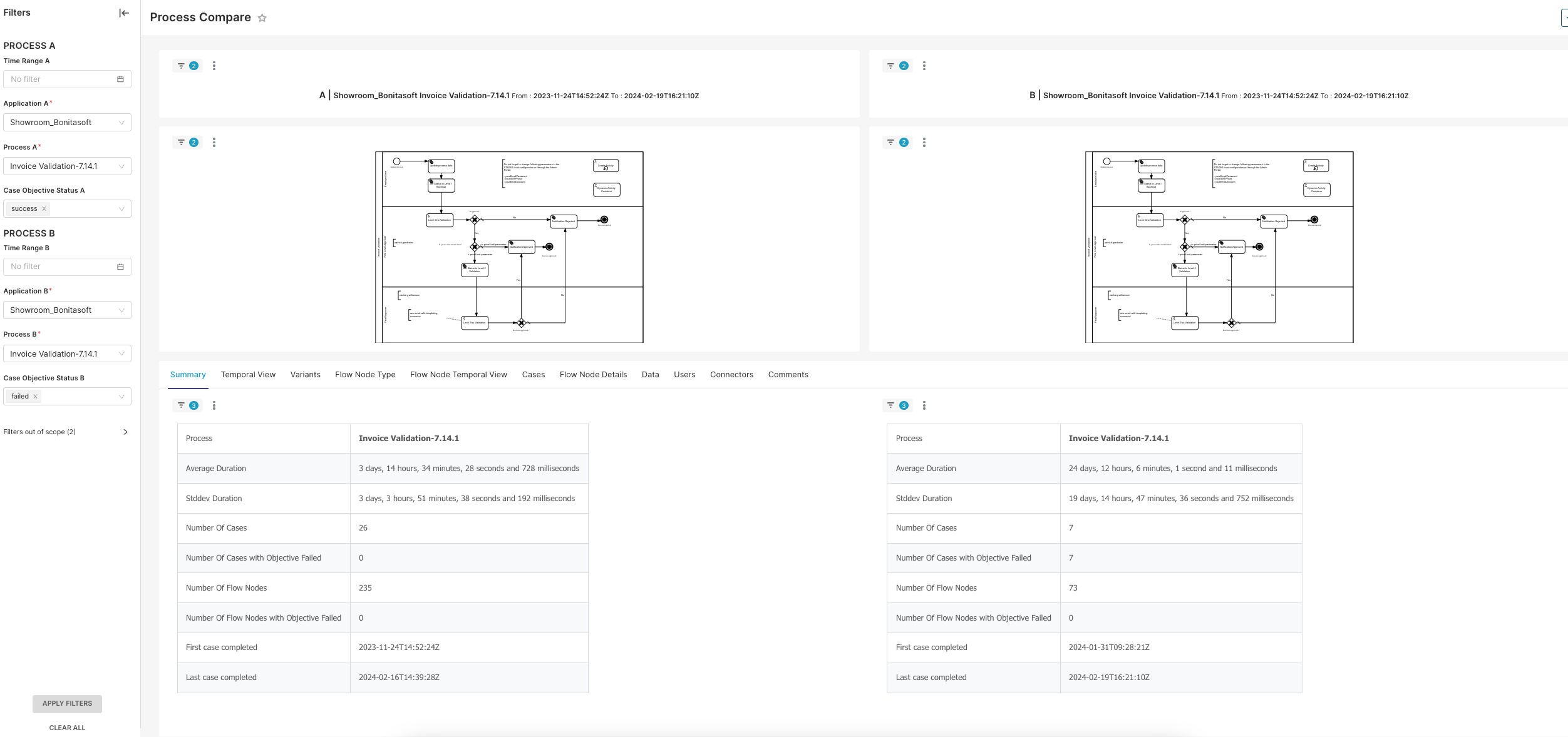
The Process Compare Dashboard is a tool for analyzing and comparing the execution of different BPM processes. User can filter processes by time range, application, specific process, and case objective status. The dashboard includes visual representations of the process flows and summary tables with detailed metrics and KPIs.
Charts and Visual Representations
Process Flow Diagrams
Description
The dashboard displays two flowcharts, each representing the flow of activities within the selected process for the respective instances being compared (PROCESS A and PROCESS B).
Purpose
These diagrams visually depict the sequence of tasks, decision points, and end points within the process. They provide an intuitive understanding of the process structure and workflow.
Components
-
Start Event: The point where the process begins.
-
Tasks/Activities: Actions taken or tasks performed during the process.
-
Decision Points: Nodes where decisions are made, leading to different branches in the process.
-
End Event: The point where the process concludes.
Usage
Users can visually compare the process flows to identify any structural differences or similarities. This helps in understanding how the process is executed and where potential bottlenecks or variations might occur.
Metrics and Key Performance Indicators (KPIs)
Average Duration
Description
The average time taken to complete the process.
Significance
This metric indicates the efficiency of the process. A short duration suggests a more efficient process, while a long duration might indicate delays or inefficiencies.
Standard Deviation Duration
Description
The variability in the time taken to complete the process.
Significance
This metric measures the consistency of the process duration. A low standard deviation indicates more consistent execution times, while a high standard deviation suggests greater variability and potential instability in the process execution.
Number of Cases
Description
The total number of instances where the process was executed.
Significance
This provides a sample size for the analysis. A high number of cases allows for more robust statistical analysis and reliability of the metrics.
Number of Cases with Objective Failed
Description
The number of process instances that failed to meet their objectives.
Significance
This metric is crucial for assessing the effectiveness of the process. A higher number of failed objectives would indicate issues that need addressing.
Number of Flow Nodes
Description
The total number of individual steps or activities within the process.
Significance
The number of flow nodes provides an indication of the process complexity. More nodes can indicate a more complex process, which might require more time and resources to execute.
Number of Flow Nodes with Objective Failed
Description
The number of flow nodes where the objectives were not met.
Significance
This metric helps in pinpointing specific steps within the process that may be problematic. For example: Zero failures indicate a robust process at each step.
Temporal Metrics
Description
The timestamps for the first and last cases completed within the dataset.
Significance
These metrics provide a temporal context for the data, indicating the period over which the process executions were recorded. This can help in understanding the recency and relevance of the data.
Conclusion
The Process Compare Dashboard is a valuable tool for BPM specialists, providing detailed insights into process performance through visual representations and key metrics. By understanding and utilizing the information presented in the dashboard, organizations can optimize their processes for efficiency, consistency, and effectiveness. This documentation serves as a guide to interpreting and leveraging the dashboard’s data for continuous process improvement.