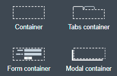
Containers
A container is a special kind of widget that contains other widgets. You can create nested containers. A typical use for containers is to control the main layout of your page. For example, if you want to create a two-column layout, you will start your page by adding two containers on the same row, each one spanning six columns of the page. A page does not need to have a container, but it is useful.
By default, a container contains one row, where you can drop component widgets or containers. You can also make the page layout dynamic by repeating a container to display a collection of data.
Adding a widget to a row
If the row has some space at the end, the widget will fill the remaining empty space in the row. If the row has no empty space, the dropped component will be automatically resized to fit a row width.
Adding a row
According your needs, a container can have any number of rows.
To add a widget in a new row, a container has two dropzones where you can drop a widget from the palette. These dropzones are located at the top of the container and at the bottom of the container. When your mouse hovers the upper or lower border of a widget in a row, the dropzone becomes visible, as shown in these examples:
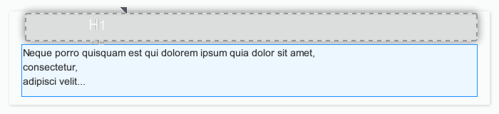
Example 1: add a title widget in a new row above a paragraph widget:
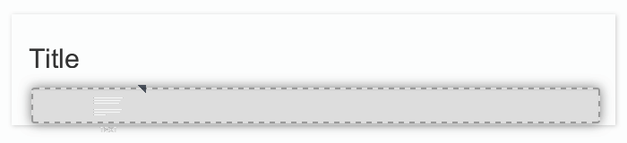
Example 2: add a paragraph widget in a new row below a title widget:
When you drop a widget in one of these two zones, a new row is automatically created.
Repeat content
A container can repeat the content dynamically. This is useful if you need to repeat a set of components for each element in a data collection. Bind the Repeat content property to an array variable. To specify the current element of the collection, use $item.
This is useful if you want to display some property of the current element.
Save as fragment
You can save any container as a fragment (from the properties panel header, widget actions menu). This enables you to reuse the set of widgets in other pages.
Tab container properties
Tabs can be display vertically or horizontally. By default, tabs is stacked above the content. If you want to display tabs in the left of the content, you can follow this tutorial.
Type property allows you to customize the tabs style ('tabs' or 'pills').
Tab properties
Each tab is a container widget. To edit a tab name, select the corresponding tab to display its properties.
The tab’s properties allows you to customize default display and behaviour of tabs based on data and/or JS expressions. For example you can hide or disable tab with a dynamic expression.
Tab title can be calculated dynamically to display and render html.
Form container
Use the form container to enable form validation for input widgets. The form container also exposes a local $form which is the AngularJS form object associated to the form container. In the Bonita Studio, if you define a contract for the task or process and click on the UI Designer icon, the generated form already contains a form container to embed default input widgets to collect the information that need to be passed to the contract to be verified. You can then define the validation you need on the input.
For example, you can bind the button’s disabled property to $form.$invalid to prevent user from clicking the button, until the form inputs are valid.
Modal container
Use the modal container to create a pop-in window.
This modal container can be opened with a button by choosing Open modal in the button’s "Actions" property.
Choose a name for the Modal ID property so you can define what modal container the button will display.
This ID must be unique for a given page.
Any button located inside a modal container can close the modal on success, during any action, when choosing Close modal in the Action property.
The Size of the modal container can be changed by selecting small, medium or large in the drop-down menu.
There is also an option to remove the animation when the modal container appears. Doing so will make the modal container appear instantly, without a fade-in effect. This is useful if multiple successive windows need to be shown.
You can add a little padding between the modal container content and its borders by typing modal-body in the CSS classes property. For a more structured content, you can add different plain containers inside the modal container, and specify any of the following CSS classes for each container, depending on its location in the modal:
-
modal-header, which creates a horizontal line underneath the element
-
modal-body
-
modal-footer, which creates a horizontal line on top of the element
A modal container cannot be located in another container. We recommend dropping all modal containers at the bottom of the whiteboard, for clarity. To embed a pop-in into another pop-in at runtime, drop the first modal container at the bottom, drop the second modal container below the first one, and drop the button that opens the second pop-in within the first modal container.